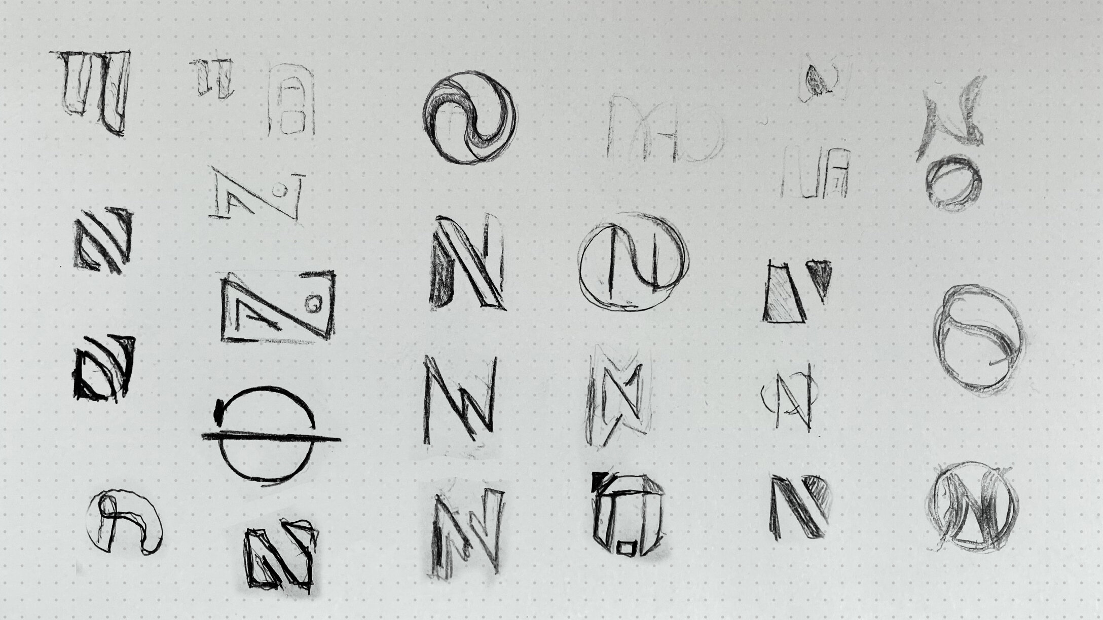
NAOMI OSAKA BRAND IDENTITY
Naomi signed on to become one of Nike’s premier signature signature athletes. From the onset, we knew her multi-cultural appeal meant she would need an identity system at a scale broader than what had ever been done before.
I helped drive an identity for her that was meant to be flexible, cohesive and be able to execute across the multitude of platforms she would inevitably need. This was inclusive of a primary mark and variations of a wordmark, to be adaptable to all elements of her quickly expanding brand. Her identity is used on product, marketing, retail and consumer facing platforms.
Art Direction: Sean Butterly
Design: Shawn Wenzel, Brandon Roegner, Matt Smith

NARRATIVE
MULTI-DIMENSIONAL
Naomi wanted to use her initials that conveyed her multi-cultural heritage, in a playful way, to reflect her personality. The N and the O merge together to symbolize this union of different cultures. Stylistically we leaned into the Japanese pop-culture vibe to reflect that playfulness and interest in high fashion/art.
PROCESS


