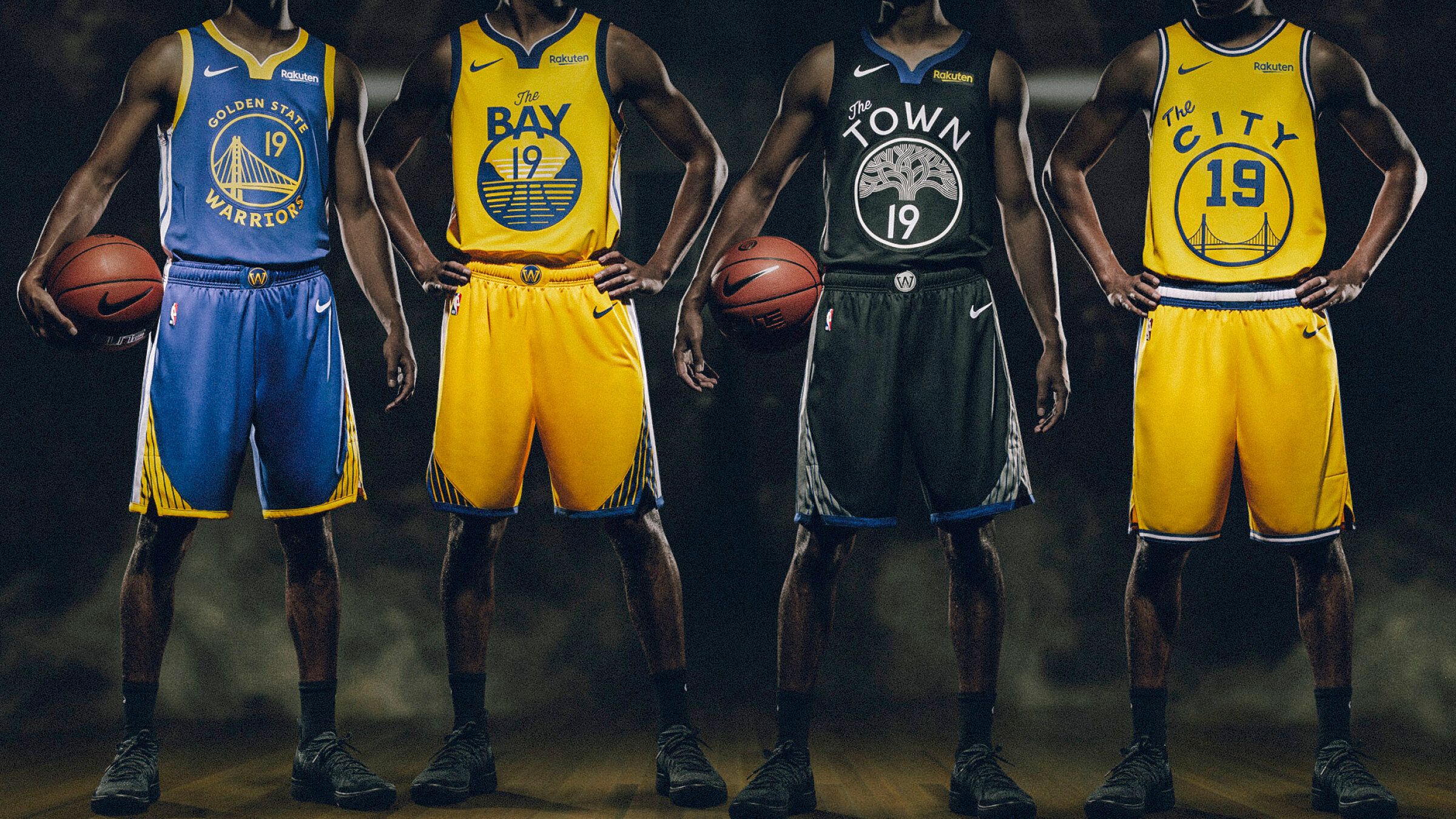
GOLDEN STATE WARRIORS IDENTITY
The Warriors approached us to overhaul their identity. Over time they’d accumulated a multitude of different marks that weren’t visually aligned. We refined elements to replicate better for multiple platforms, including digital, as well as making shared elements consistent across all marks. We also designed a modern and ownable font and number system that meshed with the updated marks. Lastly we designed an additional mark called The Bay that addressed their need to have one mark encompass all of their fans.
Design Direction: Steve McClard
Art Direction + Design: Sean Butterly, Clint Shaner
Design: Matt Smith


